by John Wall
John Wall is the author of Streamliner, a biography of Raymond Loewy published by Johns Hopkins University Press. It will go on sale Aug. 15.
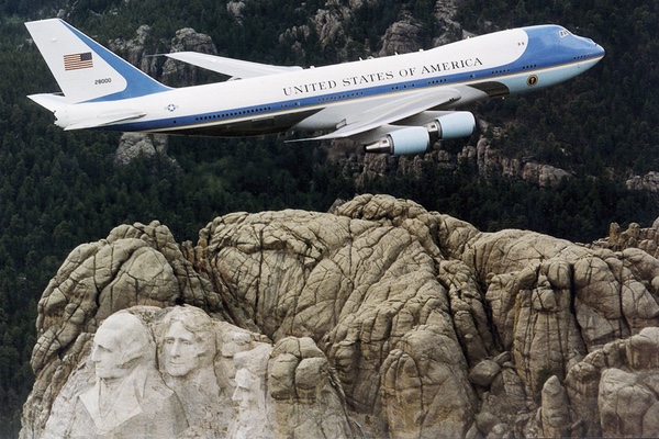
News outlets just announced that the Trump administration is going to redesign Air Force One, the Boeing 747 with the iconic blue-on-blue-on-white paint job that has heralded the arrival of every American president since John F. Kennedy.
Raymond Loewy is rolling over in his grave. First, for not receiving design credit from various news outlets trumpeting the Trumpian redo. Most media incorrectly credited Kennedy with the design. Second, for having one of his greatest visual branding triumphs overhauled by a person whose design aesthetic is “let’s see how much more gold we can pile on this.”
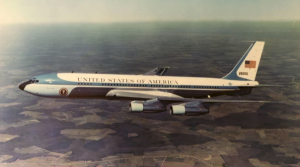
As an internationally known industrial designer from 1930 to the 1970s, Loewy was well known as the designer of Air Force One’s distinctive color markings. His iconic ultramarine blue-on-blue design has lasted almost 60 years, commissioned by John F. Kennedy, Jacqueline Kennedy and Air Force General Godfrey McHugh.
While many of Loewy’s designs did not last beyond his lifetime, the case for retaining most, if not all, of the current aircraft’s design is compelling. No single aircraft is more instantly recognizable than Air Force One. The president’s jet has been linked with memorable images, from Lyndon B. Johnson taking the oath of office on the plane after the Kennedy assassination, to any number of shots of presidents descending the stairs after a triumphal trip overseas or campaign stop.
The aircraft is a place where policy is made, friendships are forged, and seminal events in history occur. Such a vehicle carries weight as a symbol, which means, and meant even more so in Loewy’s time, thatAir Force One carried the force of the United States in its appearance.
According to Loewy’s 1979 book Industrial Design, Godfrey McHugh, the Air Force aide to the president, told Loewy a newAir Force One was being developed, and McHugh suggested that Loewy redesign the markings. Loewy claimed he did the proposal design for no pay. Loewy wrote: “I flew to the White House, the beginning of a remarkable relationship.” In his book Loewy describes presenting sketches showing Kennedy four different looks. “In every case I had replaced red [the previous predominant color of the jet] with a luminous ultramarine blue.”
The more accurate story emerges from Loewy’s own archives in the Hagley Museum and Library in Wilmington, Delaware. According to the 1967 notes in Loewy’s archive, the designer came to the White House with four graphic proposals and five lettering ideas. According to the notes, Loewy’s first ideas were predominantly red. Kennedy made the decision to make the color pattern blue. According to design historian Phil Patton, Secretary of Defense Robert McNamara had to personally authorize the color change.
The famed designer’s final creation retained the white top section but substituted sweeping shades of blue, including the aquamarine that covered the lower nose section and the cowling on the engines.
Previously, presidential planes had been identified by “United States Air Force” or “Military Air Transport Service” along the upper fuselage. Loewy substituted “United States of America” on the fuselage and placed a flag on the tail section. The flag’s union (the blue section) faced toward the nose. Loewy also reduced the intensity of the blue in the flag in order to match the blue used on the rest of the jet. The typeface for the fuselage lettering was supposedly inspired by the type used in the heading of the Declaration of Independence. As a result, “United States of America” was set in widely spaced Caslon typeface.
Media reports say the current thinking on the redesign is to create what the President no doubt would call a “fantastic and tremendous” red, white and blue. This is a grand old color scheme, but also one that has been applied to everything from bikinis to motorcycle helmets to baseball hats.
Let’s take a step back for a moment and consider. Do we really want the person who “personally oversees” every aspect of his brand–including Trump Success (a fragrance), Trump Steaks, Trump Casinos, Trump ties (extra long) and Trump wine – to come up with an aircraft design that can compete with the majesty, dignity and stateliness of the current look?
I think not. And Raymond Loewy would agree with me.